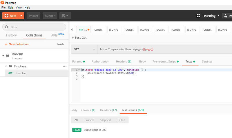
- The control chart is a graph used to study how a process changes over time
- Data are plotted in time order
- A control chart always has a central line for the average, an upper line for the upper control limit, and a lower line for the lower control limit
- Then the graph is divided into zones with each zone at 1 σ , 2 σ , and 3 σ , + or -from the average .

How it works:
- Decide a process like to collect 10 samples a day
- Find the daily average of the collected samples , example (sum of daily readings)/10
- Now follow the below steps to create X and R charts
Lets create a control chart:
X chart:
Application description:
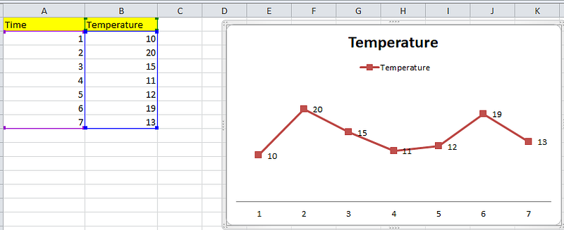
Lets consider data from a temperature sensor ,
The cloumn x1,x2,x3,x4,x5 in below table shows ‘5’ daily readings took from the sensor.
Temperature column shows the daily average of the 5 samples.
so Temperature values are obtained as (x1+x2+x3+x4+x5)/5.

Now follow the below steps:
Note: Here the time column shows sample number ( I should have renamed it in the excel)
- Create a normal line chart, with sample number in x axis and temperature in y axis
- Now calculate the average (The arithmetic mean) of the average temperature:
Which is : ( sum of all the temperature values) / total entries
(10+20+15+11+12+19+13)/7 , i.e 100/7 = 14.28

- Now calculate the deviation of each value from the average/mean.
i.e , 10–14.28, 20 -14.28 etc

- Now calculate the square of the difference we got
i.e -4.28² , 5.71^ 2 etc

- Now calculate the variance
Variance is the mean of ‘square of ‘Difference from mean’’
i.e (18.36+32.65+0.5+10.7+5.22+22.22+1.65)/7
Note: This is population variance but sample variation calculated as the sum/N-1 , so (18.36+32.65+0.5+10.7+5.22+22.22+1.65)/6
So the sum of the squares is 13.06122449 and that when divide by 7 we get 1.865889, which is the variance

- Now calculate the standard deviation ( sigma σ )
Sigma or standard deviation is just the square root of variance i.e sqrt(1.865889)

- Now calculate the UCL and LCL
Now we will calculate the upper and lower control limit which are ( Average + 3 σ ) and (Average — 3 σ ) respectively.
The graph also will be divided into zones ( Average +- σ ) and (Average — 2σ )
Which will be (14.28571429 +/- 1.365976) , (14.28571429 +/- (2 *1.365976) ), (14.28571429 +/- (3* 1.365976) ).

What next:
Now we use this chart to monitor the results
When new results comes in we will see:
- whether its inside or outside the limits ,
- Is there a pattern in result, for example, all the values are above average ( so we need to re caliber the tool properly)
The chart will be re-calibrated when we have more data and we will recalculate upper and lower limit to make sure that the result are more precise.
R Chart:
R chart considers the range of the sample points
Let us consider similar example above
Here we are taking 5 temperature value samples from the tool daily ( In above case we add this value and divided by 5, to get temperature sample average)
Now calculate ‘Range’ value ‘R’
We get R by subtracting (max-min) from the daily sample set
for example, in first row 33 is the max value and 23 is the min value, so R = 33–23 = 10. Plot it in graph

Now calculate average of R:
Add all the R values, and divide by no of samples : i.e : (10+9+13+….+6)/10 = 100/10=10.

Now calculate the UCL and LCL for R chart:
The equations for finding UCL and LCL for R chart are as below:
- UCL = D4 * Rbar
- LCL = D3 * Rbar
Were are D4 and D3 are R constants who’s values depends on the number of sample taken daily.
Here values taken per day (n) = 5
and total number of samples (k) = 10 ( we have samples for 10 days)
Now the value of D4 adn D3 depends on ’n’ and is as below:
reference : https://www.spcforexcel.com/knowledge/variable-control-charts/xbar-r-charts-part-1
Note: no data means ‘0’

So as our ’n’ value is 5, D3 = 0 and D4 = 2.114, and we have Rbar = 10
Hence,
- UCL = 2.114 * 10 = 21.14
- LCL = 0*10 = 0
Output:

What next:
Now we use this chart to monitor the results (Range)
When new results comes in we will see:
- whether its inside or outside the limits ,
- Is there a pattern in result, for example, all the values are above average ( so we need to re caliber the tool properly)
The chart will be re-calibrated when we have more data and we will recalculate upper and lower limit to make sure that the result are more precise.
Note:
You can also calculate UCL and LCL of X chart using Rbar value

Were A2 is again a constant that we can get from the Table 1.
Note:

Reference: